Last Tuesday I was at my local supermarket, standing in line and glancing at the magazine rack when suddenly my heart skipped a beat. Was that actually a comic book down there in full frontal view? An actual, adult oriented comic (ironically vertically positioned at a child’s height)? Then, the image on the cover and the name above the title suddenly clicked with something I’d recently heard about on the radio. Regardless of my enjoyment of the comic I bought, that Tuesday I felt instantly happier because for the first time since I was twelve, I’d actually bought a ‘serious’ comic in a store that was not specialized in comics.
Amoras #1 (Standaard Uitgeverij)
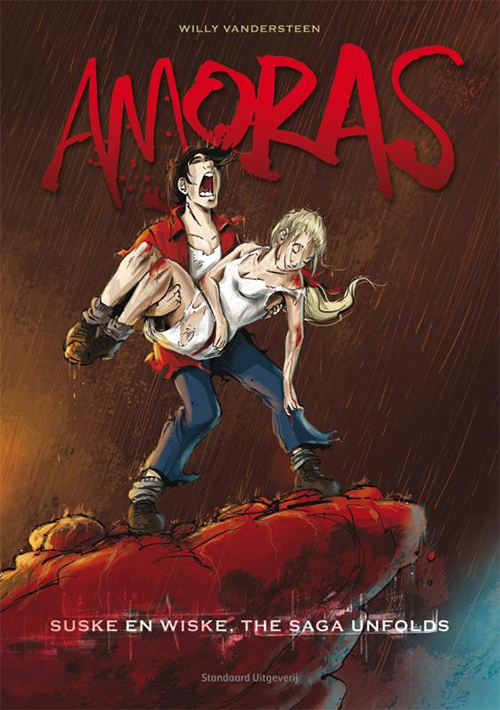
The title of the comic I bought is ‘Amoras’ and above the title the cover displays the name Willy Vandersteen. Vandersteen is the creator of one of Belgium and the Netherlands biggest comic series Suske en Wiske (or in translated editions, according to Wikipedia Spike and Suzy, Luke and Lucy, Willy and Wanda or Bob and Bobette), and these are the main characters in Amoras. Suske en Wiske, first published in 1945 was (and still is) a very kid-friendly, all ages book,  combining elements of science fiction and fantasy covered in a thick layer of action and humour. In honour of the centennial birthday of Vandersteen, the publisher has started this spin-off title, in which the familiar characters, events and settings take a dramatic u-turn from what the reader is used to with Suske en Wiske.
I have never been a fan of Suske en Wiske. As far as I can recall (the last time I spent any amount of attention to reading an album must have been over a decade ago) the storytelling was very stiff, the humor as sharp as a spoon and the ligne-clair art-style did not appeal to the teenager that was gorging himself on 90’s superheroes. So, before I delve into the actual reviewing here, I have put a disclaimer that I know next to nothing about these characters and I’m looking at this Euro-comic through a lens that was sharpened on American comics.
This is the first issue (actually a 54 page album) in an on-going series; the next instalment is planned for next fall. Basically what happens is Suske and Wiske (suddenly nearing the end of their teenage years) accidentally end-up in the year 2047. What we see of the world has been turned into a mysterious dystopian wasteland, where Wiske is kidnapped by Dr. Krimson who runs a high tech fascist police state. Of course, Suske attempts to rescue her and gets help from a new female character called Jérusalem. Back in the current time, regular cast members Lambiek, Jerom (estranged from each other) and Sidonia find out that Suske and Wiske are missing. While a third plot thread deals with their friend professor Barabas being abducted by the clumsily time-hopping Dr. Krimsom to improve his 3d-copied version of Barabas’ Tele Time Machine.
To me this whole project reminded me a lot of the recent ‘reboot’ at DC comics over in the States. When they stopped their whole line of comics to restart them all with new number ones, the line-wide trend throughout most of the 52 new titles seemed to be going back to the 90’s as far as art was concerned as well as focussing on darker, edgier stories. They even had a TV ad backed by a dark, heavy metal-grunge soundtrack. And the whole Amoras package seems just a little too much ‘look how dark and gritty Suske and Wiske have become’. I find the idea behind it interesting, but to me as an outsider it feels like a desperate measure to try and bring in new readers… (…and I’m not seeing anybody jumping back to the original title because of this ‘edgy’ spin-off.)
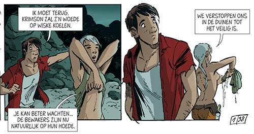
Story-wise, this first instalment lacks originality. Sure it’s cool and fun to see Wiske physically fully developed running around in a sexy outfit, or Jérusalem attempting a trip to sexy town with Suske. It’s also kind of refreshing to see the titular characters curse like actual people do, as well as actually physically hurting their adversaries. But these novelties do not outweigh the fact that the story regurgitates all the beats of any standard time travel story. Also, I got really irked by story/continuity inconsistencies (in one panel Suske is wearing a gun over his shoulder while in all the surrounding panels he remains unarmed, in another panel Jérusalem -who it’s established is deaf and can only understand people through reading their lips- is talking with Suske while turned with her back to him, see image above). However, I’m not ready to write-off writer Marc Legendre. I had not read any of his earlier stuff, but it turns out he’s pretty accomplished and I’ve just ordered his graphic novel ‘Verder’(apparently the only comic to have ever made the short list of the prestigious Dutch Libris Price for Literature). Hopefully my next experience with his work will click more with me.
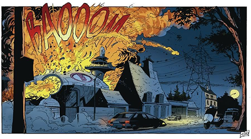
Is Amoras the creative explosion that will draw in new readers to the Suske en Wiske franchise? Only time will tell (Art bij Charel Cambré, from Amoras #1).
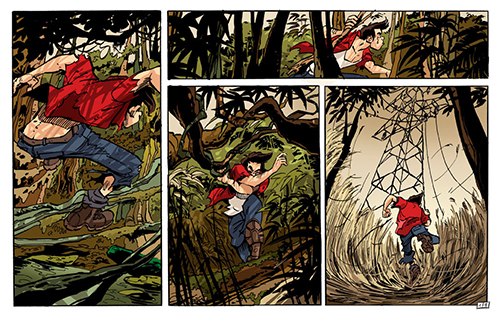
The art of the series is delivered by Charel Combré. Being an American comic fan, the first thing I thought when I saw his art is ‘this guy needs a strong inker’. In no way is this guy a bad artist, but the line-work is a little too inconsistent for my taste. Some panels are scratchy, sometimes thick and thin lines don’t really blend in a way that makes sense to me. Other panels are quite gorgeous and clean however. I also looked at the press kit for this Amoras and saw some of Combré’s pencils, which in my opinion look better than the final product.  Also, I did a Google image search on this guy and found out he did the artwork for a title called Mega Mindy, in which he used straight edged, bold lines giving his art a much more clear, clean and confident look. Throughout most of the book the colouring (also by Cambré) is superb, but the last couple of pages seem rather crude in comparison. To end things on a positive note, there are flashes of brilliance in the widescreen action scenes at the beginning of the book and throughout the book the dynamism is excellent.
Ultimately, I think the idea behind Amoras is interesting and a very worthwhile endeavour. However, I have my doubt about the execution and I seriously question how many readers will jump from this series to the regular Suske en Wiske. Regardless of my critiques, I DO admit I found it hard to give this book a fair chance. Unconsciously, I was hoping the book would not deliver and confirm my preconceived notions about Suske en Wiske. Because of this, I will revisit Amoras in November for the second album and try to give it a fair shake to win me over.
Art 6.5 Writing 5 (+1 for the idea behind this series)
Overall 6.3

