Tag Archives: New52

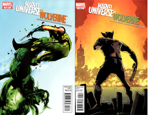
Runner ups for week 41: Swamp Thing 2, The Rinse 2, Marvel universe vs Wolverine 3&4

2. Swamp Thing #2 (DC comics)
This isn´t a gay thing or something, but man am I hot for Scott. Comic writer Scott Snyder that is. For a relative newcomer he has a remarkable track record. I´ve read all but one of the series he has worked on and loved them all (American Vampire being the exception). This newest incarnation of Swamp Thing, continues this trend. The second issue of this series was wordy, very wordy. But not in a bad way. This issue explains whether or not Alec Holland ever really was Swamp Thing. It also explores a new take on the Swamp Thing saga, as we learn that the Swamp Thing is a legacy character. According to this, the swamp monster that we have grown to know and love is only the most recent incarnation of the living embodiment of ‘the green’. In this issue a representative of the parliament of trees offers Alec Holland the chance to become Swamp Thing, and as such to become their greatest knight and take the fight to the new bad guy Sethe. After his decision, he gets chased out of his motel by a mob of Sethe’s twisted walking corpses, only to be saved by the person he really didn’t want to meet. Really great art by Yanick Paquette once again, with things like birds and plants which actually look like the way they do in the real world. This is my surprise hit out of the 52 new books by DC, I had never read any Swamp Thing, but this offers the perfect jumping on point. Art:9                   Writing:8.5              Overall:8.7

3. The Rinse #2 (Boom studios)
I continue to be amazed at how exciting writer Gary Phillips has made this story about money laundering. This should be boring and dry, but instead it’s both intelligent and informative as well as raw and thrilling. Most of all though, this is one of those very original series, which we only get few and far between. That’s why I’ll savor this story. Sure there are crime comics, mostly they handle with fucked up people doing fucked up things. But this is something else entirely, the main character is a successful small time hustler who gets tied up in a very big case. Before he knows it he’s got both mobsters and police after him. Phillips has infused his characters with a great deal of humanity. All of them, no matter how small their role, have an extraordinary strong and realistic presence on the page. And to make this click even better, once again we are treated to a perfect cliffhanger. The art by Mark Laming seems a bit cleaner, compared to the first issue. It looks like Laming’s gotten confident enough to do his own thing and isn’t leaning as much on influences from Sean Phillips on Criminal. Now I’m wondering if publishing this review will get me followed by the anti-money laundering bot again…
Art:8               Writing:9                    Overall:8.5

4. Marvel Universe vs Wolverine #3-4 (Marvel comics)
This series follows the events of the world being overtaken by an airborne virus that turns people (including those with superpowers) into aggressive, base savages. In the end, it’s up to Wolverine, Captain America and the Punisher to take a stand against the infected (lead by the Hulk), while Marvel’s top scientist try to fix things. Great covers, beautiful art and everything that would make a die-hard marvel reader excited: unexpected team-ups; graphic violence (the Hulk bites Wolverine’s arm off); characters that have never interacted with each other, driven to do so out of sheer despair; plus some dramatic action scenes featuring a virtual who’s-who of the Marvel universe, all rendered in really intense, dark art. The art by Laurence Campbell and Lee Loughridge reminds me a little of Sean Philips. Which talking of whom, this series reminds me a bit too much of the original Marvel Zombies by Philips and Robert Kirkman. I think that this reads much better, because it’s not intended as jokey/mondo/exploitative as Marvel Zombies was. Also, I don’t understand why the ‘zombies’ are still cognizant but seem to have devolved a couple of thousand years. They know no science, but only magic, and both Hulk and The Thing have kind of donned a shamanistic wardrobe. This series was really well written by Jonathan Mayberry, one of the most underrated writers at the big two. I would really like to see him write Marvel´s next big summer event. Ultimately though, I have to say I was disappointed by the ending of the series. There’s no real resolution, just a two year later epilogue that leaves a lot of stuff open. Still that doesn´t take away from this being one hell of a romp through the darkest corners of the Marvel universe.

#3 Art:8.5                   Writing:8.5                 Overall:8.5
#4 Art:8.5                   Writing:7.8                 Overall:8.2

Quick shots for week 41: Dinosaurs, zombies, reboots, boobies, X’s, cyborgs and conspiracies

5. Super Dinosaur #4 (Image comics)                                                                          8.4
Another solid issue. Action packed, great art, cool new gizmos. Really, this has anything any age of reader would want. My only problem is that I just can’t get over the fact that the main character is calling himself awesome all of the time. But I guess that will come around on him some time in the future.
6. The Walking Dead #89 (Image comics)                                                                    8
This issue of The Walking Dead is just like every other, a well written and beautifully drawn story about Rick Grimes and his group of survivors getting in (and hopefully out of) a pickle. There seems something weird about Charlie Adlard’s art this issue. It’s a bit looser or something, it’s like he’s stepped over to working digitally with a tablet or something. Ah, well it’s still solid art.
7. The Flash #1 (DC comics)                                                                                                     8
Great art, hit and miss writing, a sequential flow that didn’t work very well outside of the action scenes. The story of this first new installment of the Flash was pretty interesting and delivered an interesting cliffhanger. I dig the armored redesign and the illuminating speed lines on the uniform, but this is one of those redesigns I think will look worse when drawn by many other artists.
8. The Big Lie
(Image comics)                                                                                             7.5
Great, inventive and balsy concept about a scientist that has traveled back in time to save her husband from the World Trade Tower attacks of 9-11. There’s a lot of exposition here, with the main character talking to herself to explain what’s happening, which feels a bit too old school for me. Also, I was kind of bummed that this is only a one-shot, I would love to have seen more of this woman, trying to convince people of the coming doom with her footage of the attacks on her futuristic device (an Ipad). While I like the story and concept, I have to say that I find the time of release on the decennial commemoration of the attacks in poor taste. Especially since the story is told with a dark sense of irony, the book being introduced and closed by a panel of Uncle Sam joking about lies. I understand and appreciate the reasons to present a story which is a thinly veiled metaphor for all the warnings that were ignored by the Bush administration before the attacks, I just wish it could have been brought a bit more respectfully.
9. X-men Schism #5 (Marvel comics)                                                                            7.2
As great as the last issue was, as mediocre and forced this final issue was. I appreciate the (much needed) shift in status quo that the events in this series present the X-men. However, Wolverine and Cyclops continue to duke it out, while the super Sentinel attacks and ultimately the two veteran X-men are saved by the X-kids, that’s just so unnatural and contrived, I can’t believe I read it. I did like the little epilogue of Wolverine, Iceman and some kids leaving Utopia and heading back to Westchester. The art was regrettably subpar, I always like any Kubert, but in my opinion this issue represents the low point in the art of this series.
10. Stormwatch #2 (DC comics)                                                                                          7
Who are these Adam and Harry Tanner? I’ve never read any of the previous Stormwatch volumes, just the Authority spin-off. As much as I like the first issue, the writer and as much as I wanted to like this issue, it just wasn’t very good. The plot was unclear and the art looks rushed and inconsistent. Mayor bummer!
11. Tarot. Witch of the Black Rose #69 (Broadsword comics)                    6.7
A June issue I still had lying around, this made me feel uncomfortable on SO many levels. This was made worse by reading it with my wife next to me on the couch. Let’s just get this out of the way: I like boobies as much as the next men. But there’s a time and place for everything, and this book draws so much attention to the cheese cake, it draws attention away from other aspects of the book. Sadly, this may actually be a good thing, because otherwise there’s not much there. The art, while sexy was inconsistent, and artist Holly Golightly seems way more experienced in drawing hot chicks than guys. The story was not bad, but not very good either. We got treated to a big fight scene, which while fun was pretty standard, not withstanding a fun little twist at the end.
12. Terminator Robocop. Kill human #2 (Dynamite Entertainment)     6.5
Uhm, was Robocop ever this ‘human’, I know him mostly from the movies and cartoon series, but wasn’t he mentally more machine than human? In this issue he gets all emotional and curses like a Detroit sailor. This series offers the interesting concept of Murphy moving back in time to help Sarah and John Conner stop Skynet and thus apparently interfering with the movie continuity? I’m not entirely sure if the artist (PJ Holden) is suited for this book though. I think his raw, shadowy and edgy style would work better in a horror book than in this action packed sci-fi story.
13. X-men. Legacy #255 (Marvel comics)                                                                  5.9
I’m sad to see this book slowly going out with a whimper. It started strong with writer Mike Carey at the helm and spinning out of the Messiah Complex crossover. Yet, almost immediately the series was hampered by art that didn´t look quite as good as that in the other X-books. Add to that, that this initially was the X-book that stands apart from most of the continuity of the other X-books, while relying heavily on knowledge of earlier X-men continuity and it becomes apparent that this book was never destined to be a big seller. But over the last couple of issues even Carey has dropped the ball more and more. While I love the fact that we’re finally getting a rescue mission for the X-men that have been stuck in the far end of space for the last five years, I strongly doubt the execution could be more terrible. Characters act wildly inconsistent, the story lacks any kind of lackluster and the art is over rendered and incoherent. I want to see how this arc pans out, but I think I’ll be leaving this book, even though I have been a vocal supporter of it for so long…

Runners up for week 39: Batwoman 1, Sweet Tooth 25, X-men Schism 4

2. Batwoman #1 (DC comics)                    
A flawless continuation of the Batwoman story by Greg Rucka an JH Williams III, showing that Williams doesn’t only have magic artist skills, but also writing skills (not to forget co-writer W. Haden Blackman of course). Art-wise, I would have liked to give this issue a ten, but I found some of the two page panel layouts were a bit confusing. But that’s a minor complaint of a beautiful book. This sees and explains Batwoman having broken off with her father and taking on a side kick, which I totally dig. This may be my favorite of the DC relaunch books, although I really think it’s an unfair comparison as this book has had a yearlong lead in time. Oh, and sometimes I get a bit over-enthusiastic about little art details (like the way I enjoy Yanick Paquette’s rendition of pigeons) and this issue has another pet peeve of mine: breaking glass. This issue has the most wonderful splash of flying glass I have ever seen. But it’s not just glass that looks great, Williams divides the book in two art styles. Detailed and photo-realistic with a thick line and stark color choices, for the out-of-costume scenes and beautiful painterly for the suited-up Batwoman scenes. I am in love with this book.
Art: 9.5           Writing: 9                   Overall: 9.2


3. Sweet Tooth #25 (Vertigo)                               
Jeff Lemire is a cruel Canadian donkey humper. There, I’ve said it. Not only is he evenly talented as a writer and artist, not only does he create one of the most unusual comics out there, but he’s also a cruel man. I’m not talking about the stuff he puts his character through in the book, but what he puts the reader through. For something like ten issues he’s led the reader to believe that one terrible thing has happened, which has influenced every decision made by two of the most important characters in this book. Well, in this issue, we learn that things did not pan out as we were originally led to believe… OMG, this has to be the cliffhanger of the year! I won’t spoil anything but oh what a surprise twist! The art is just as great as usual. Story-wise, the tension between Jepperd and the girls comes to a head. And he finds himself turned away from Gus, the (buck)boy he has sworn to protect. In my opinion, this is the best written issue in this series so far. We learn whether or not Gus survives being shot, then we see the group of survivors make a decision about staying at a safe location or heading further north, and then there’s this great, great cliffhanger!
Art: 9              Writing: 9                  Overall: 9

4. X-men Schism #4 (Marvel comics)      
This is like Marvel’s Civil War cross-over event, only for the X-men. The main point of conflict between Wolverine and Cyclops being whether or not they should put children on the battlefield. Cyclops thinks this is the case, Wolverine disagrees. They argue over this in front of the kids, Wolverine stating that the island nation of Utopia isn’t worth dying over, while Cyclops argues that this is where mutant kind should make their stand. And all the while there´s this crazy powerful super-Sentinel coming their way, with the purpose to destroy their home, Utopia. When Wolverine can’t convince Cyclops (or the children), he places explosives all over the island and threatens to blow it and the Mega Sentinel up, once it’s close enough. The children evacuate and then things get rough as Cyclops says: “She never loved you, you know. You always frightened her.’ At which Wolverine replies: ‘And if she was here right now… who do you think she’d be more frightened of?’ (Best X-men dialogue since ‘Professor X is a jerk!’?). This quip makes Cyke snap and things get physical, very physical as the two main mutants duke it out with a deadly Sentinel looming over them. All drawn very competently by the legendary Alan Davis and written by the writer who really gets the X-men, Jason Aaron.
Art: 8              Writing: 9.5                Overall: 8.7

Quick shots for week 39: Kirby Genesis, getting caught up with my MArvel and some more DC 1’s

A beautifull two page spread by Alex Ross and Jack Herbert, from Kirby Genesis #3, published by Dynamite Entertainment.

A beautifull two page spread by Alex Ross and Jack Herbert, from Kirby Genesis #3, published by Dynamite Entertainment.

5. Kirby Genesis #3 (Dynamite Entertainment)                                                      8.5
This feels like an action packed Saturday morning cartoon, complete with a giant toyline. There are like a hundred characters in the cartoon, so they can sell all kinds of cool action figures. If that doesn´t sound too good for you, let me just spell it out for you: This comic is excellent! There’s a bit much going on and there really are a lot of characters. But they are all extremely well designed, very distinct from one another, very original and just like this series, heaps and heaps of fun! Basically, this series tells the story of a normal, realistic world (not unlike ours), which in the span of a couple of hours gets bombarded with a whole bunch of superheroes and villains (all unused or license-free creations of legendary comic creator Jack Kirby). The whole world quickly goes ballistic, while we follow a kid named Kirby, who is looking for his girlfriend (who turned into some kind of power princess) and in doing so gets abducted by aliens, together with Sasquatch and subsequently delivered in the land beyond time… (come on, need I say more?)
6. Ultimates #2 (Marvel comics)                                                                                         8
Contrary to the first issue, this really felt like its own beast. This isn´t so much a new take on Millar and Hitch’s (or Hitlar as we know that duo on the millarworld forums) run on the Ultimates, but a good story by Jonathan Hickman about the Ultimates. This issue, things are jam-packed with action. And once again I appreciate the bold editorial choices that have been made to set the Ultimate universe apart from the 616-verse. [Spoiler:] All the Asgardian gods (except for Thor, it seems) get killed by the inhabitants of evil Reed Richard’s sphere society.
7. New Avengers Annual (Marvel comics)                                                              7.9
Interesting story about former Avenger Simon Williams (AKA Wonderman) trying to end the Avengers with his own team of superheroes. First target, the New Avengers, [spoilers], they go down relatively easy, which was kinda surprising. But of course they aren’t the big league Avengers, which are their next target. So, I’m curious to see how that will pan out. The art was interesting, not great but pretty good. I think what made the art by Gabriele Dell’Otto back on Secret War particularly impressive, was all the dark areas which hid a lot of details. This issue plays out in clear daylight and we see much more details, which diminishes the impact of his linework.
8. New Avengers #16 (Marvel comics)                                                                      7.5
Very well written story about how Daredevil gets to join the New Avengers. A cute tie-in to fear itself. Yet, again Bendis does this thing where the story is narrated through interview scenes. I can’t stand them! They work great however, especially in this issue. The art however ugh… I (really!) like Deodato a lot, but the coloring here is not helping him, it’s making it far too photorealistic. Plus the architecture and Nazi mech armors look computer generated, which doesn’t look good.
9. Green Lantern #1 (DC comics)                                                                                     7
Not enough action. I like the premiss of Hall Jordan without a ring, without a job and without money, and seeing Sinestro (of all people) with a green ring. Well played comedic bits. There´s just not enough action and that’s what the art team of Mahnke and Alamy do best, which is a shame. Will check out the second issue, but I’m still very cautious.
10. Fear Itself #6 (Marvel comics)                                                                                     7
Once again, the grade is pulled down big time through the writing. I don’t think I’ll be back for the next issue. The writing was a bit better, art a bit worse compared to earlier issues.

Will try to get the Book of the week and Runner Ups online tomorrow or the day after. Titles to be reviewed: Batwoman #1, Ultimate Spider-man #2, Sweet Tooth #25 and X-men Schism 4.

Book of the week: Batman 1

Batman 1 variant cover by Ethan van Sciver

1. Batman #1 (DC comics)
Again with a Scott Snyder book? Yes, again with a Scott Snyder book. I understand how much it looks like I have turned into a mindless Snyder fanboy as of late (last week his Image book Severed was my book of the week for the second time in a row, and his first issue of Swamp Thing was my third favorite book of the week). But this man has some major story-telling props, he’s a fan of the medium and an accomplished novelist. Apparently, those things make for a deadly combination when writing comic books, whether they be of the horror kind or the superhero ones. But I digress…

I was honestly worried that the DC reboot would interfere with the quality of Scott Snyder’s magnificent run on Batman, which started back in Detective Comics. If this first issue is a good measure, my worries were uncalled for. Not only is this a perfect continuation of the noir-ish story he was already telling, it’s also a damned good first issue for entirely new readers (while small sayings and Easter eggs are there for readers of Snyder’s Detective Comics run to remind them, that this story is naturally progressing). The rebooting stays at a bare minimum in this title, aside from Jim Gordon not having grey hair anymore, I can´t see any changes in the continuity.

Jim Gordon by Greg Capullo

Look who got his hair dyed, it's Jim Gordon as drawn by Greg Capullo in Batman #1 (DC comics).

The story picks up with Bruce returning to Gotham and relieving Dick Greyson of his duty of playing Batman, after traveling the world in Batman Inc. Besides that we see Bruce, Dick, Tim and Damian visiting an elite party, where Bruce unveils his plans for the Gotham skyline. Later we see Batman meeting up with detective Harvey Bullock, to investigate a weird, sadistic, ritualistic murder which reveals a message for Bruce Wayne. The issue ends with a cliffhanger showing DNA traces of the culprit found at the scene of the crime pointing to someone very close to Batman.

Batman rogues by Greg Capullo

It's a couple of Batman's enemies as rendered by Greg Capullo in DC's Batman #1.

It is very smartly written, as a narrative we read a speech Bruce Wayne gives about Gotham, while the issue starts out with a small breakout at Arkham Asylum introducing (and showcasing artist Greg Capullo marvelous new renditions of) Batman’s rogues gallery. Later on in the story we learn about Bruce’s new contact lenses, which have incorporated facial recognition software. This allows for a couple of caption boxes to introduce all of the secondary characters. In an interview with Snyder over at War Rocket Ajax I heard him say that this story arc will build on all his previous Batman work (including the Gates of Gotham miniseries). This excited me to no end, because I really liked the villain that got introduced in Gates of Gotham. In this issue we are already seeing the seeds of how this all may connect to Gates of Gotham (Wayne enterprises is aggressively investing in Gotham’s future architecture).

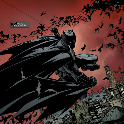
Batman and the bats by Greg Capullo

This is how good Greg Capullo can make Batman look, art from Batman #1 by DC comics.

And, (oh boy) the art. I’m not very familiar with Greg Capullo, in my mind he was ‘another one of those Image’ artists. But oh my God is he good! He is the perfect successor of Jock and Francisco Francevilla. It’s dark, it’s dynamic, it’s detailed, highly stylized and a bit exaggerated. Capullo was born to draw the Caped Crusader and it looks like he’s having a good time doing so. Especially the scenes where Bruce is in costume look fantastic! In the plain clothes scenes I get the sense that Capullo’s style isn’t really my cup of tea. But notwithstanding my personal taste, this looks ravishing.
Art: 9.5                 Writing: 9           Overall: 9.2

Quick shot reviews for week 38: If I read another first issue I’m gonna be sick…

A sweet two page sread of recess at Gladstone's school for World Conquerors, art by Armand Villavert.

A sweet two page sread of recess at Gladstone's school for World Conquerors, art by Armand Villavert.


5. Gladstone’s School for World Conquerors #1(Image comics)            8.7
After having read issues 2-4, this issue quickly and entertainingly explains why the school is named Gladstone’s. Besides that it does a pretty good job of introducing the students of this school for super villains: Kid Nefarious, Mummy Girl, Martian Jones, Ghost Girl and Skull Brother one and two (which we later learn will play a surprisingly important part in this story). Besides setting up the school (including such classes as explosives 101, extortion, oversized reptiles and home economics), and the characters, the story does a great job at unveiling a bit of the driving plot of the series: at the end of the issue we see a hero and villain meeting up in secret to arrange their next fight. The art is by Armand Villavert is beautiful, with sparse, delicate and highly stylized linework it reminds me a bit of the art by Corey Walker in the early issues of Invincible. The big difference being that Gladstone’s look a bit more playful. I think an extra round of applause should be reserved for Mr. Carlos Carrasco for his stark color combinations, which makes the art pop off of the page and makes the book stand out of the crowd.
6. The Vault #1 (Image comics)                                                                                             8
This had come out a couple of months back as well, but I hadn’t gotten around to it. The Vault tells the atmospheric and brooding story of an underwater treasure hunt. It reads very good, and feels like an excellent horror/thriller movie. But don’t worry, it doesn’t read like a movie pitch. It’s a well crafted comic which, I really dug. At first I was a little disappointed by what the treasure hunter team finds. But at the end, let’s just say I wasn’t anymore, and the horror/mystery vibe got amped up quite high. The art (quite photorealistic ) was a bit too standard for me, but that may be a personal taste thing. It fitted well with this story.
7. Demon Knights #1 (DC comics)                                                                                      8
Nothing wrong here, perfectly likeable book about DC characters both widely known (Etrigen, Madame Xanadu, Vandal Savage) and lesser known (the Shining Knight?). Looks good, reads even better. It takes place in the dark ages, I think it’s very interesting to see the early roots of the new DC.
8. Wonder Woman #1 (DC comics)                                                                                   8
Well, finally we’re back to a good Wonder Woman story. Great art by Cliff Chang. I don’t really know what else to say. Diana looks gorgeous, she gets involved in a murder plot against the unborn child of Zeus and thing are a quite dark. Good, clean fun, with a bit of a horror edge to it. Well worth your money.
9. Ultimate X-men #1 (Marvel comics)                                                                             8
I liked this mostly because of the characters, though the art (Paco Medina) and writing (Nick Spencer) didn’t hurt either. The characters of course are Karen Grant (aka Jean Grey), Angel (not Warren Worthington III), James Logan (little Wolverine) and firegirl (?) from Ultimate X and Johnny Storm, Bobby Drake and Kitty Pride from back in Ultimate Spider-man. Apparently Kitty is becoming ´the most feared and hated terrorist in the history of the United States´, which sounds very interesting. My only critique is that there was a bit too much going.
10. New Mutants #30 (Marvel comics)                                                                            8
Mephisto offers the team a deal to escape from Hell that seems so innocent I can’t imagine (but know there will be) a catch, while Dani Moonstar is defending Hel (notice how this one’s got only one ‘l’?), against the forces of the Fear Itself villain (the Serpent, right?). Great art by David Lafuente, especially the Dani scenes. This guy is so extremely good with expressions, it’s just a joy for the eye to watch the faces in this thing. The story by Abnett and Lanning is solid, fun and entertaining, though I’m still not sure they’ve got the newest recruit, Nathan Grey (aka X-man), pegged just yet.
11. Grifter #1 (DC comics)                                                                                                          8
I liked this despite never having read any Grifter prior to this. This is mainly due to the interesting plot, revolving around Grifter before he’s Grifter being abducted by telepathic space aliens (!?) while on his escape from a swindle. Unbeknownst to him, he’s missing 17 hours from his memory. Because of the abduction, his escape plan goes awry, he does escape from the aliens, but then is hunted by said aliens. Sounds a little out there, but it was really amusing to see that this wasn’t just another superhero story, but more of a science fiction mystery thriller.
12. Red Hood and the Outlaws #1 (DC comics)                                                     7.9
We get a very exploitative portrayal of Starfire, which I certainly notice (but have no problems with whatsoever). Beautiful art, okay story. I didn’t understand anything in the second half, other than Red Arrow and Starfire getting freaky together. But maybe that was the point as the last caption says: ‘to be explained’ instead of ‘to be continued’. So, at the least they have piqued my interest.
13. Pigs #1 (Image comics)                                                                                                     7.6
I really didn’t want to read another first issue, but this just looked so good. A stunning cover by Jock, followed by a conspiracy story about a second generation Cuban sleeper cell that’s gotten activated in the present and wants to overthrow the US government. The story switches between past and present and spans nearly 60 years. This is sure to be one of those rare books that’s rife with historic accuracy (the two authors must have done a ton of research) and political intrigue. The art wasn’t the strongest part of the book, but served its purpose well and got progressively better.
14. Star Trek #1 (IDW Publishing)                                                                                    7.5
Pretty standard Star Trek fare here, both story and art are pretty decent. This is a well told story about what looks like a psychic attack after the latest Star Trek movie. Get it if you’re a big Trekkie or really liked the last film (which both applies to me). Props are due to artist Stephen Molar, for really making the characters resemble their motion picture counterparts. If you’re not into Star Trek or the last movie, this is just ‘one of those comics’. It’s certainly not bad, not great either. But positively entertaining, just like many other comics.
15. Nightwing #1(DC comics)                                                                                7.5
This seems to be tying into the cliffhanger from Batman #1, it appears that somehow Dick Greyson has another alter ego besides Nightwing, which Gotham´s heroes don’t know about. Well written by Kyle Higgins, he’s got the relationship between Dick and Bruce down and writes Dick like a real person (eating cereal, grabbing his costume from the floor, facing his fears and insecurities etc). Now the art… it’s great in the action scenes, the rest though… …not so much. When people aren’t fighting they look stiff and indistinct, plus there are way too many two page spreads here.

Come back soon, for more wordy reviews of the top four books I read this week. In no particular order: Gladstone’s School for World Conquerors #5, Batman #1, Ultimate Spider-man #1 and Criminal. Last of the innocents #4. 

Runner ups for week 37: Crawl to me 2, Swamp Thing 1, Jezus Hates Zombies 1

2. Crawl to me #2 (IDW Publishing)
I reacted quite strongly (with my whole body) to this issue, because of this follows a guttural review (sorry, I’ll be swearing up a storm), describing my reactions as I was reading. Just to be clear: This is a horror book about a young family who is vacating their new home were something is horribly wrong. [written at page three:] The first couple of pages had me going ‘What the Fuck?!?!’, almost every panel. [Written at page nine:] Holy shit, I know this can’t be real. Ryan, the main character also knows this, but holy shit is this working on my nerves. We’ve landed smack dab in crazy town. [Written at page ten:] And just when you think things have turned back to normal, people have no eyes. This is some fucked up shit! [Written at page fifteen:] OMG she’s just cutting her hair, but it’s SO fucking creepy!!! [Written at page sixteen:] But I guess that means Ryan isn’t crazy (or at least not the only one whose crazy), as the scissors are talking to her… ‘You know what you have to do right?’. Oh no. No. Not the baby, right? [Written at page seventeen:] And then it looks like the baby’s gonna bite it… Shit man… [Written at page eighteen:] I’m clenching my fist here and have a weird feeling in my stomach… Things are not right. [Written at page twenty-two:] And it ends with the creepy child molester’s belt buckle. Wow, this went fast, but it was scarier than a fucking roller coaster!
Art:9               Writing:9        Overall:9

3. Swamp Thing #1 (DC comics)
It took me a while to get into this issue. I didn’t really care for the first half, but the story really picks up in the last third. That’s the part where we learn about a dreadful new villain (emphasizing once more that Swamp Thing is unmistakably a horror title). This part also shows how Alec Holland is plagued by ´the green´ (Swamp Thing’s connection to all of the world’s flora) and his memories of being Swamp Thing. While I wasn’t particularly excited about the writing, the art though… Oh, my God can this Yanick Paquette guy draw. He was already wonderful recently on Batman Inc., but with this series he has even improved upon that. For a random example of his unequalled artistic qualities, the first page of this book has the best looking pigeons I’ve ever seen in a comic book. They don’t just look like random birds, colored to look like pigeons. These are some realistic goddamned pigeons. Also in my review of Justice League #1, I said Superman’s new costume looks kind of like a royal ceremonial armor. …Well scratch that, in this issue he looks like a fascist superhero… Which I bet is not what DC was aiming for…
Art:9.5                        Writing:8        Overall:8.8

4. Jesus Hates Zombies. A Jurassic kinda life #1 (215 Ink)
This was one of my favorite reads in some time. Especially the number of chuckles (and even laugh out louds) it got from me made it rocket up the chart. The story by Stephen Lindsay doesn’t particularly make a lot of sense (however, I haven’t read the first Jesus Hates Zombies series, so who knows?), but if you want to read something completely different, you should really try it out. While the main character is Jesus (H.?) Christ, this isn’t your momma’s Jesus. For one thing, this Jesus curses like a sailor. It’s surprisingly refreshing to read the son of God go: ‘Sweet candy cane strap-ons! Is it really you, buddy? Fucking miracles never cease!’ Other important characters in this are Abe Lincoln (Jesus’ main wingman in prehistoric times), Benjamin Franklin, (SPOILERS) Elvis Presley and the animated wheelchair of Steven Hawkins (?)… The story: Jesus and Abe are stuck in prehistoric times, which for some reason is becoming infected with a zombie epidemic. They’re struggling with the decision of just getting back or saving reality as they know it. I thought that beyond the Walking Dead I was zombied out, but this proves me wrong. It actually a very good story, both exciting and funny and accompanied by outstanding, energetic artwork by Belgium artist Rob Croonenborghs. The book is black and white, uses a lot of effective dot patterns for extra texture. The only problem I had with this is the format. While there isn’t necessarily anything wrong with a smaller format, I thought some of the more diminutive panels became a bit unclear because of the scale. But seriously go check it out, it’s a ‘gloriously fun-filled prehistoric romp’ of 64 (!) pages.
Art:8.5                        Writing:9        Overall:8.7

Quick shots for week 37: Space fights, money laundering and vampire whacking!

5. The Mighty Thor #4 (Marvel comics)                                                                   8.7
This issue Thor is packing the funny: ‘Aye, Omnipotence has its down side’. And we get to see that rarest of things in all Marvel comics: a glimpse inside the head of Galactus! Buy this issue for great all-out action between Galactus and Silver Surfer on one side and Thor, Odin and nine other Asgarians on the other. This is how a fight of cosmic proportions is executed, there are high stakes (they are fighting over an object that could sate Galactus´ hunger and thus save untold billions of lives throughout the universe), holes in big purple heads and blows that launch opponents through solar systems. And it’s all drawn really pretty by Oliver Coipiel, who went all out on the designs for Asgardian space suits.
6. The Rinse #1 (BOOM Studios)                                                                                      8.6
A crime series about high finance and low-down greed. Think the criminal part of Ed Brubaker’s and Sean Philips’ Criminal, combined with the procedural stuff from television’s The Wire and that makes for one hell of an interesting and original crime comic. We follow a hustler who’s very good at laundering money. In this issue he gets involved in a high stakes operation as well as, quite surprisingly, the law. The art felt a little like Sean Philips lite, which isn’t really a bad thing. The story was very good. Can’t wait to learn where this is going.
7. Batwing #1 (DC comics)                                                                                                 8.5
I think this is the second issue with Ben Oliver art I’ve ever seen, and I’m pretty sure I have become of fan of this guy. I picked this up because this spins out of Batman Inc., which I have loved thus far. This first issue, written by Judd Winnick, really is surprisingly good. We follow this guy that has gotten Batman Inc. support in an African country. He works for the police in his day job, which provides him with opportunities to tie his day and night work together. And that’s just what happens in this issue as he stumbles upon the work of one Massacre. Massacre seemingly likes to decapitate and dismember people and build structures with different body parts (hey, to each their own…). So, be warned this is pretty nasty, graphic, bloody stuff.
8. OMAC #1 (DC comics)                                                                                                       8.2
Read this because of all the buzz it got on the Eleven O´Clock Comics podcast, and while I get the cause of the enthusiasm, I just don’t share it. That may be because I’m not such a big Kirby fan as they are, or because I’ve never read any OMAC prior to this. Basically, this introduces OMAC as a kind of mind controlled super strong robot/cyborg Mohawk Smurf, that breaks into the Cadmus laboratory to hack into the mainframe. In doing so he reconnects his ‘master’ with the Cadmus database. It’s a fine comic, especially the art is very strong. Keith Giffen, channels Jack Kirby, while staying through to his own style and puts more details in his pencils than I think I’ve ever seen him do. This results in great dynamic art and exquisitely detailed backgrounds. What was visually most appealing to me is the coloring by Hi Fi studios. The dialogue was okay, but the flow of the story and especially the action was great. It’s just not really my cup of tea. I will pick up the second issue, but I´m still on the fence about continuing after that.
9. The Mighty Thor #5 (Marvel comics)                                                                       8
What happened this issue??? Well, things get VERY epic as Odin and Galactus knock each other out. Galactus got on his feet again, Odin didn’t. Then there’s also Volstag who’s preparing for war with the citizens of Broxton, Oklahoma. And Thor is jealous that Sif is riding on the Silver Surfer’s board… The art was a little worse for wear and Oliver Coipiel (maybe my favorite current artist) got an art assist from Khoi Pham, who is a great artist in his own right and can change his style well enough to match Coipiel, but it’s just not as good as Coipiel firing on all cylinders.
10. Sanguis #0 (DROP comics)                                                                                        7.7
Wow. That was good, that was very good. This short prequel flows like a motherfucker, has some strong Humberto Ramos inspired art, exquisite, rough and moody colors as well as strong, confident inks. This sets up the story for what we can expect in the following issues, a priest with a magical medallion, a hot chick vampire hunter, vampires (of course) and balls-to-the-wall action! I was bummed that the rest of the series will play out in current times and not in the ‘40’s, like this issue. A minor critique is that the inks on the last story page stood out a bit compared to the rest of the issue. That doesn’t spoil the book though, I’m excited to read on and curious as to what I’ll find in future issues.
11. Sanguis #1 (DROP comics)                                                                                          7.7
This again was very good. You get the feeling it’s written in English by a non-native, (which it is of course) however this does not take away from the experience, or the story (which is very intriguing) and makes me very curious for next issue, which is written in Dutch. In this issue we follow Father Fred as he heads out to Switzerland to fulfill the dying wish of his friend bishop Van der Steen. Here he meets the Frauenknecht family who is secretly tasked with the protection of the ‘best guarded secret inside and outside the church.’ A secret that goes back hundreds of years and currently hangs around the neck of the attractive young Frauenknecht daughter, Eve. What this issue lacks in action (especially compared to last issue), it makes up for in flow and smart story telling techniques. The art takes a weird turn this issue, it’s just as good as last issue (though again it looks like the inking is a tad inconsistent here and there with varying line thicknesses), but is different stylistically. While last issue it reminded me of Humberto Ramos topped off with some beautifully rough inks and colors, this issue the colors had a bit of a less rough texture. The pencils however, are still reminiscent of Ramos. Nevertheless, I get a stronger Tony Moore-vibe, with a bit of a Declan Shalvey edge to it… What makes this issue particularly strong though is the acting of father Fred. The grief over the loss of his friend, as well as the amazement of heading out to Switzerland for who-knows-what, are written very clearly all over his face.
12. Sanguis #2 (DROP comics)                                                                                         7.6
I loved the backmatter explaining a little about the artistic process of Dimitri Jansma. I really like to see artist evolve (or just change it up a bit), and that’s just what you get when you read Sanguis. Visually, every issue subtly distinguishes itself from its predecessor. Though I personally enjoyed the styles of the first two issue better (this issue showcased some adventurous color choices in certain panels), this looks top notch too. I especially liked the big splash page of people outside of a silhouetted house. It looks very peaceful, which I guess is exactly what it’s supposed to convey. In this issue writer Gert-Jan van Oosten continues to show his skills as a storyteller. Sanguis #2 flows really good, and in only two and a half issues Van Oosten has created a richly detailed world, which I really want to know more about. In this issue main character Fred Siebelink meets two centuries old, Sanguis warriors (aka holy vampire and werewolf hunters). Just as they’re starting to get acquainted, all hell breaks loose as they are attacked by a coalition of (weirdly familiar) werewolves and vampires. Enter one kick-ass action scene. My only nitpick of this series is that I want to know more about the Sanguis and the world they live in, I understand the need to keep some things a mystery. But I think that when we learn a bit more, readers will be vested in this world more strongly. Understandably, that might not be possible in the format they have for Sanguis. But maybe a future issue could have a prose peace, offering some sweet revelations or something. Come on DROP comics, the people demand more Sanguis!
13. Herc #6.1 (Marvel comics)                                                                                          7.5
Good jumping-on point and cute story about Hermes being ordered by Zeus to find the depowered, former god Hercules who has pillaged the legendary weapons cache of Ares, to continue his journey as a superhero. Fun issue, but that’s a given with Fred van Lente and Greg Pak writing Herc. Not so keen on the Mike Grell art though…
14. The Living Corpse. Exhumed #1 (Dynamite Entertainment)                   7
I bought this because of the super sexy (though really misogynist) cover. Sadly, (well, maybe not) things didn’t get so steamy (rapey) on the inside of the book. The art looked fine, though I was inked a bit too stiff if you ask me. Story-wise it was a fun, action packed issue of The Living Corpse fighting vampires. Also, a good cliffhanger revealing the villain of this book.
15. Static Shock #1 (DC comics)                                                                                     6.2
After having read (and loved) John Rozum’s latest volume of Xombi, I had high expectations for this series. Sadly they weren’t met. They didn’t even come close. The first half felt like a bad nineties comic (everything, from character designs, to buildings, looks like nineties Spider-man). Early on this issue is nothing but horrible dialogues, combined with mediocre art. In the end the quality picks up a little but not enough for me to stay interested. This issue sees Static working as an intern at Star Labs, having moved to New York. Unbeknownst to him, he becomes involved in an incomprehensible criminal plot, which ultimately (SPOILERS) seems to cost him an arm. Hence the name of the next chapter: ‘Disarmed’. (Really??? DC doesn’t think that’s a little on the nose?) I will be back, but only to see how they handle this mutilation…

I guess I’ll be lowering the number of books I’ll be reading the following weeks as I’m busy with both work and internship as well as having just cracked open the original book version of Game of Thrones by George R.R. Martin.

Runners up for week 36: #new52, Stormwatch 1, Animal Man 1, Action Comics 1

2. Stormwatch #1 (DC comics)            
Okay, I love the first couple of volumes of the Authority (I finally got around to buying the trades yesterday) and this has me all giddy about those characters again. Very exciting to see some of my favorite familiar faces back like Jack Hawksmore, Jenny Quantum (the spirit of the 21st century), the Engineer and of course Apollo and Midnighter. In equal parts due to their appearance, their original use of superpowers and their bad-ass personalities these characters are among the very best of the spandex crowd to have arrived fairly recent.  It will be really interesting to see how this team will interact with classic DC characters. A tip of the iceberg was already shown, as Martian the Man Hunter is part of Stormwatch (as well as the Justice League). Basically, Stormwatch is the interdimensional secret superhero police. This new series is basically Stormwatch trying (very unsuccessfully) to get Apollo to join them because they want someone with ‘Superman-level’ powers. But then the roguishly handsome Midnighter sweeps all the members of Stormwatch off their feet to hit on Apollo: ‘I’m the Midnighter. With your help, I can kill every evil bastard on the planet. Interested…?’ (Cheers for my favorite couple in comics) Great art too! Oh, and what’s with the shimmering red cloaked guy that’s showing up in all the new 52 first issues?
Art: 8             Writing: 9       Overall: 8.5

3. Animal Man #1 (DC comics)        
This introduces Buddy Baker, aka Animal Man, just as I remember him. This guy can tap into the morphologic field of all the world’s fauna, to use the animal characteristics he needs. A superhero despite himself, yet foremost a family man. The first half of this issue tells you everything you need to know, neatly and elegantly. Without spoiling too much, first we get to know him and his wife and two children in his home environment. Then he puts on the costume to stop a guy who’s holding hostages in the children’s ward of the local hospital. In this sequence we learn about the kind of hero Buddy is. He´s hesitant to use violence, much rather trying to talk conflicted persons out of their troubles. Lastly we see one of his nightmares, which is portrayed wonderfully disturbing and then we see him waking up to see the weirdness has hit his private life again… Okay, now that´s a creepy cliffhanger… …well, maybe it´s not so much the cliffhanger that’s creepy, as much as the visuals of it (keep away from the last page if you’re allergic to dead animals). Nothing wrong with the writing here, leave it up to Jeff Lemire to rock his keyboard and make some magically good comics. Now the art though… Until the relaunch announcements, I´d never heard of Travel Foreman. And in the lead up to the relaunch his work got pretty hyped. And although I love the cover, and this issue´s dream sequence, I just couldn´t get into the rest of the art. It´s not bad, just not my kind of style I guess. It improved throughout the issue, but not enough as I´d like. Something about the rough, detailed line-work and lack of blacks just doesn´t sit well with me.
Art: 7.7           Writing: 9       Overall: 8.4

4. Action comics #1 (DC comics)      
This is a hard book for me to review, I had pretty high expectations, which weren’t met. Which doesn’t mean it’s a bad book, not at all. It’s pretty good, just not quit here nor there for me. Basically it’s whats been dubbed Bruce Springsteen Superman, with his shirt and jeans and working man’s boots. He’s a little edgier than we’re used to, threatening non-super powered villains with death. He’s also a lot more brash, making statements to the media that: ‘You know the deal Metropolis. Treat people right, or expect a visit from me.’ He seems to be standing up for the little people more than ever, which I also like. It gives him a bit of a political activist edge. Also, this issue introduces familiar mainstays like general Lane, Louis Lane, Jimmy Olsen and Lex Luthor. Plus a great Morrison idea of weaponizing the city against the man of steel. Art was pretty good, reminded me more than a little of Mark Bagley on Ultimate Spiderman for some reason. Come to think of it this whole issue kinda feels like the ultimate take on Superman: He’s younger, has to start from scratch in modern times, gets deconstructed to the ground, hmmm… Well if it worked for Spidey, it surely can’t hurt Supes. Plus if Bendis can pull something like this, I think Morrison should be able to do it well enough too.
Art:Writing: 8       Overall: 8

Come back tomorrow, to see if I can add anything new to my already extensively formulated love for Locke and Key. As I review the latest issue of Locke and Key. Clockworks…

Quick shots for week 36: Three Dutch comics vs three US comics

5. Ultimate Hawkeye #1 (Marvel comics)                                                                 7.8
This feels like an extra shot of Jonathan Hickman’s Ultimate goodness. Good art, I only felt it wasn’t distinctive enough for my taste. Very well woven into the story of last week’s Ultimates #1, curious to see where this goes. This kind of portrays Hawkeye as the operative most likely to one day follow in Nick Fury’s footsteps as head of SHIELD. And I can totally dig that.
6. Invincible #82 (Image comics)                                                                                    7.6
Good issue, although I’m not thrilled by the Ryan Otley art, which was still good, but not as great as much of his run on this series. Also, it was fairly inconsistent. I’m still on the fence on the coloring, which is getting progressively more painterly over the last couple of issues. The story though, I really like. It’s showcasing Robert Kirkman’s ability to throw everything around. Sure Invincible is still a superhero, but everything around that is becoming different than it has been and Mark being a superhero may be history soon too. In this issue he starts questioning the aggressive approach and tells Cecil Steadman, superhero liaison at the Pentagon, how he wants to try talking instead of hitting, more often. Which I really want him to try. Peace man!
7. Captain Roffa #1 (Windmill comics)                                                                         7.4
Very fun comic produced in my old ‘hood, especially liked the art. The concept is basically Captain Marvel but as a local Rotterdam superhero. The two stories by Johan de Neef is executed very well. A bit too gag-like for my taste, but still very entertaining. But as said: mayor props go out to Boykoesh, this young artist I met at Breda yesterday. He does some great cartoony and extremely dynamic stuff, which gives the book an action packed feeling. His art is topped with very confident, clean line-work and beautiful greytones. Also, this guy does some distinctive personalities and facial expressions: There are a couple B-list Dutch celebrities in there (Tatjana Simic and Marijke Helwegen) and while depicting them very cartoony, he retains their distinctive facial features. Recommended for everyone who loves Rotterdam (look for such Rotterdam celebs as Erasmus, Bokito as well as the Euromast, and both Sparta and Feyenoord jerseys), or a tongue-in-cheek superhero parody.
8. Batgirl #1 (DC comics)                                                                                                           7
Oh, so that’s how they explain away the paralysis. I for one have no problem at all with this explanation for Barbara walking again. While it doesn’t happen often, some people do regain the use of their legs, after severe spinal cord injury. Plus, the reboot has shortened the time that she’s spent in the chair and it’s also implied that she’s still not totally comfortable on her legs. Having gotten that out of the way, there’s nothing keeping me interested here. Until……we see Barbara freeze up when she gets a gun pointed at her. She’s afraid of being crippled again. Interesting, a superhero afraid of guns… Still wondering about the new DC timeline though…
9. ACE #1 (DROP comics)                                                                                                       6.8
Compared to the zero issue, the art has improved a lot. In this issue Ranjit shows a bold, confident line, which I like a lot better. Writing-wise there are big improvements too, basically the blockbuster movie continues. The ACE team (Action Committee Extraordinary), with all kind of sexy recruits and mysterious superpowers (a multiple man, good fighting guy, a healer, a telepath etc) investigating and taking action against a really bad guy and his corporation. This hits on all the notes, funny, action, sexy… Some minor things though, the lettering in the word balloons fits a little too tight. Also, sometimes things are happening off panel and it’s not entirely clear what’s happening… Still I am very impressed with this early foray into independent comics publishing. If every issue keeps getting better as much as it did between issues zero and one, this will end up as a damned good comic and a strong product for DROP comics to show their skills. This also has me very interested in the rest of their titles.
10. ACE #0 (DROP comics)                                                                                                    6.3
Back in 2009, this was one of the fist comics out of the Dutch DROP comics studio by Gert-Jan van Oosten and his talented collaborators, and it kinda feels like that. ACE has a very interesting premise of an anti terrorist strike force with superhuman abilities. This basically reads like a big blockbuster movie filled with action (…duh…), car chases, sexy women and a funny bit every now and then. While it was very entertaining, and I liked the art by Ranjit Domisse (think of J. Scott Cambell) and the layouts, I thought the inks and dialogues where a bit rough. Hopefully this will get better. A refreshing detail is that this story plays out in the Netherlands, so expect to see a lot of Dutch scenery.